Build Site 
Effortless Website Creation for Everyone
Get Started
90 Days for free trial , No card required

Effortless Website Creation for Everyone

Build your site with ease, no coding skills required.

Select from a variety of designs tailored to your needs.

Enjoy fast, secure, and dependable hosting for your website.

Get help anytime from our dedicated support team.

Boost your site's visibility with built-in SEO tools.

Create and maintain your website without breaking the bank.

Agency description
Article description
Barber shop with appointment.
Construction description

Consultancy description

This is course theme
Donation description

Ecommerce shop description

Event description

Hotel booking theme
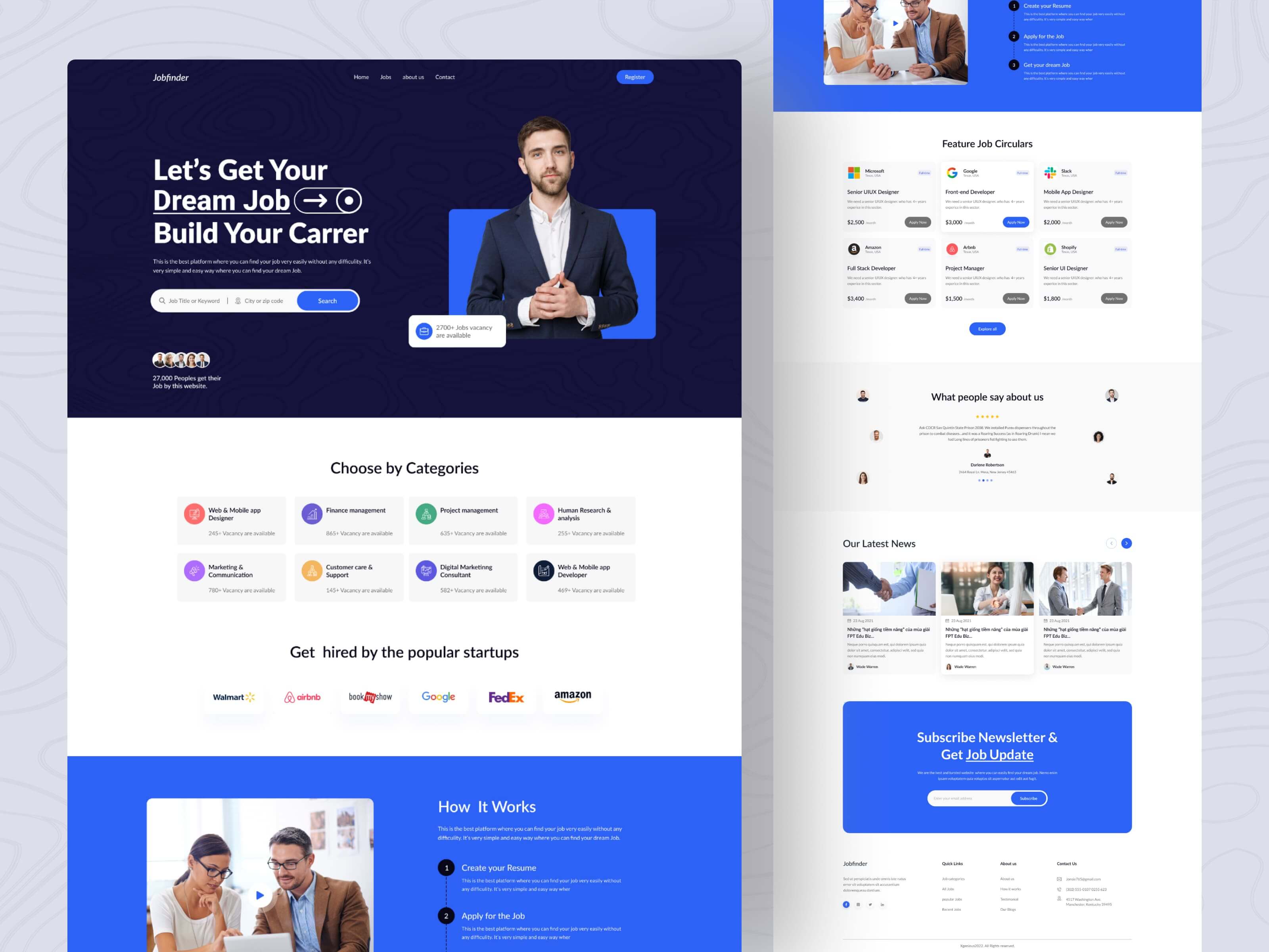
Job finding description

Newspaper description
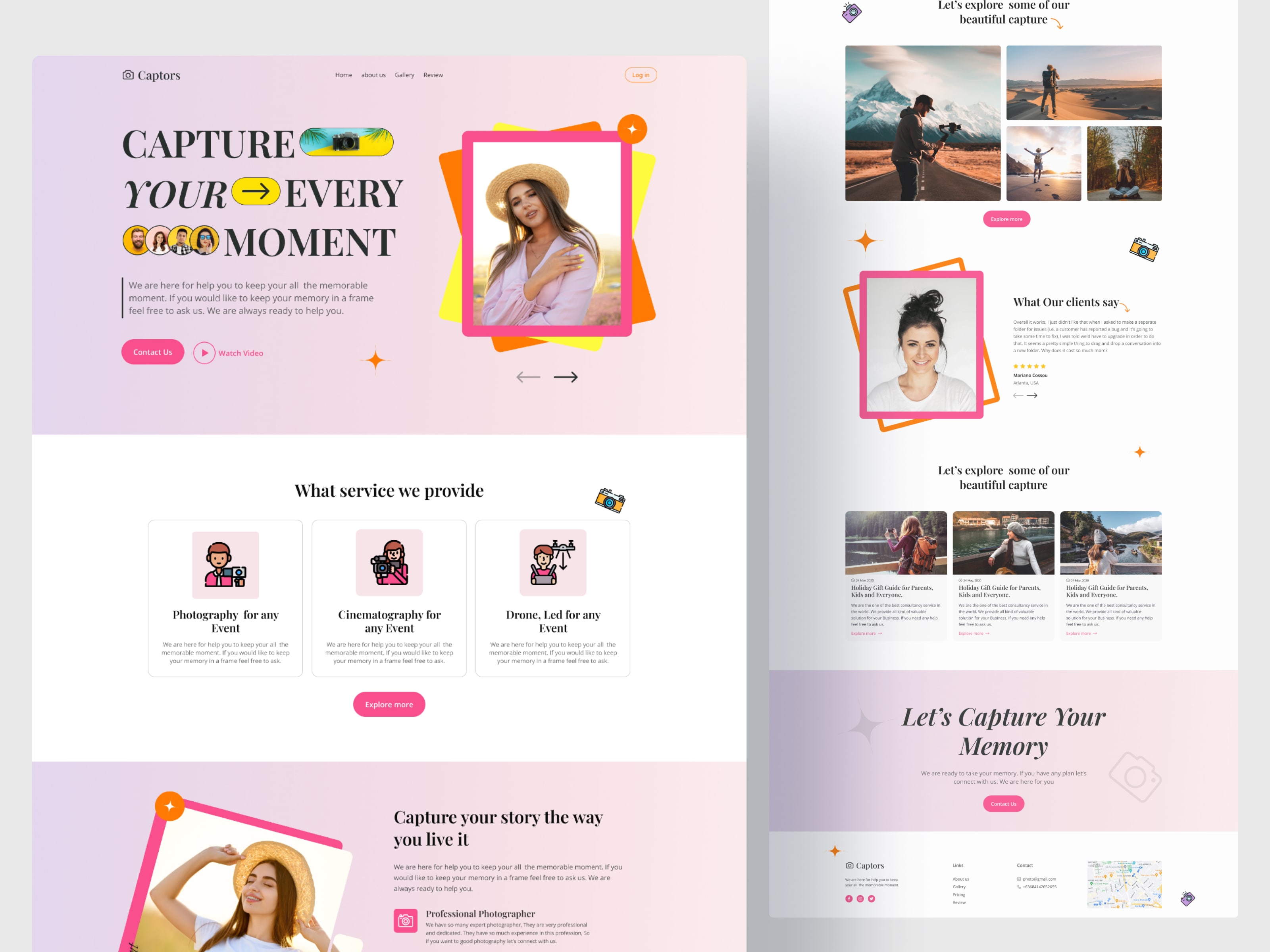
Photography description
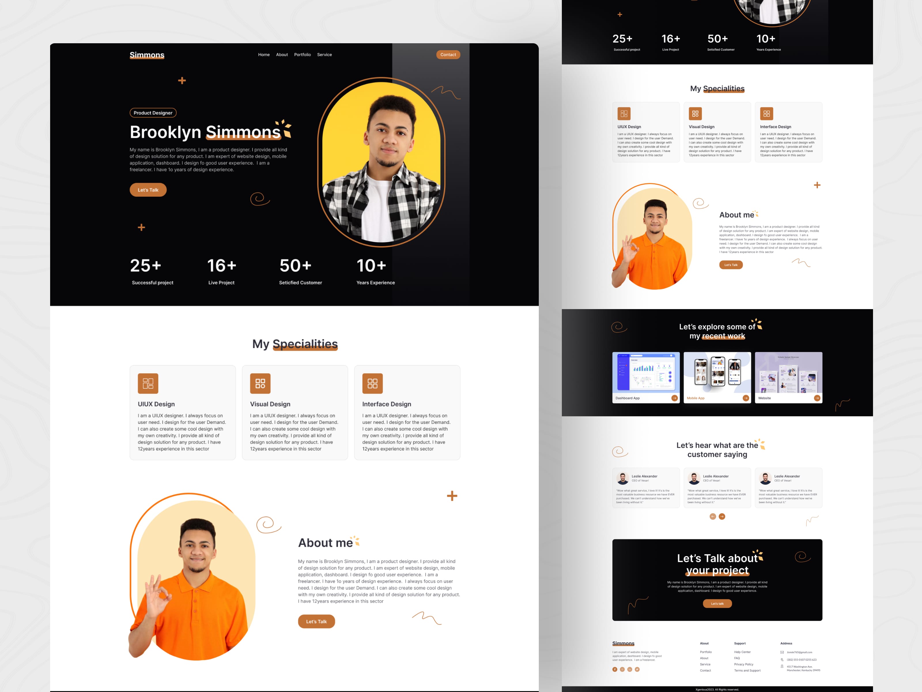
Portfolio description
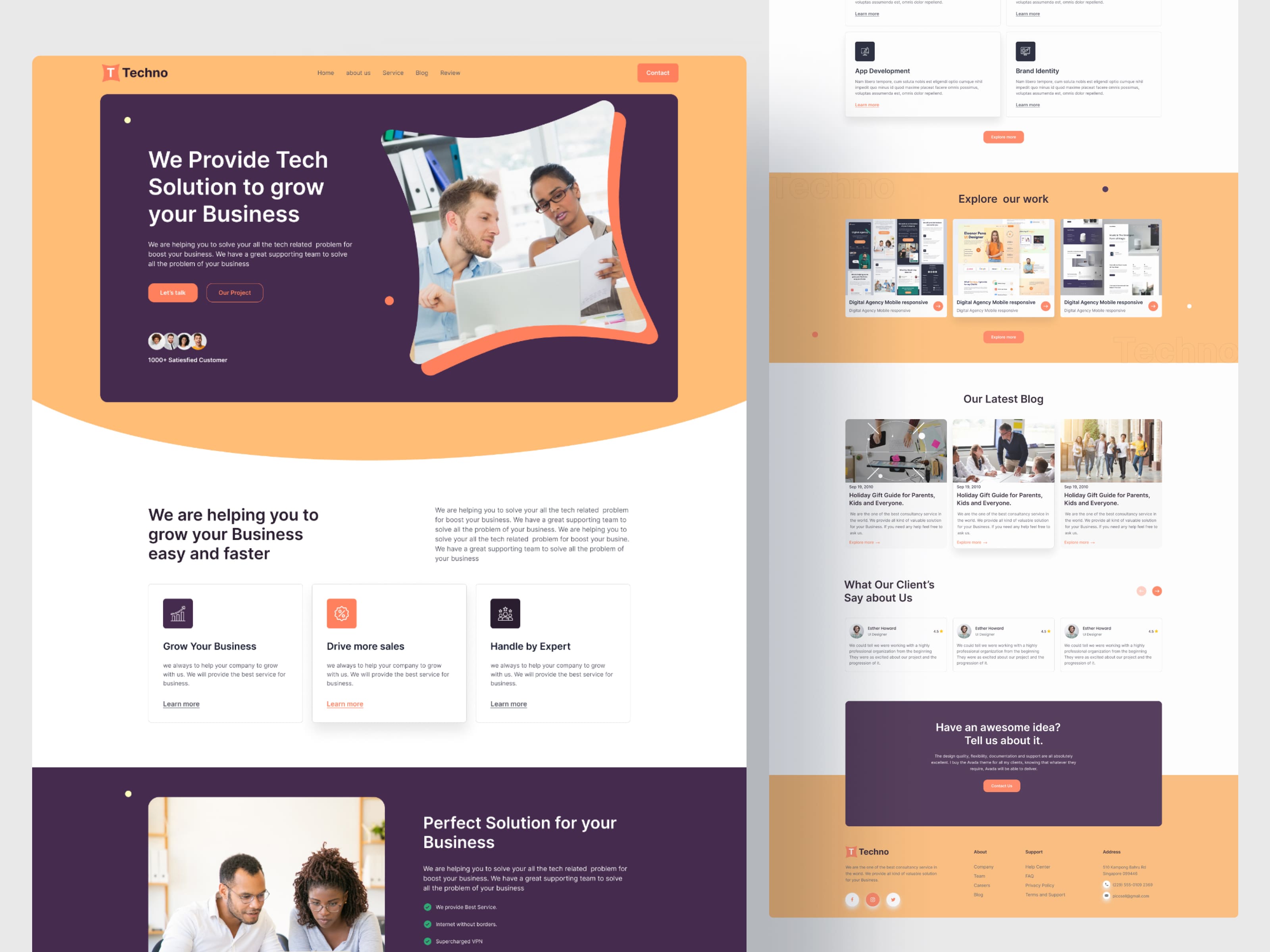
Software business description
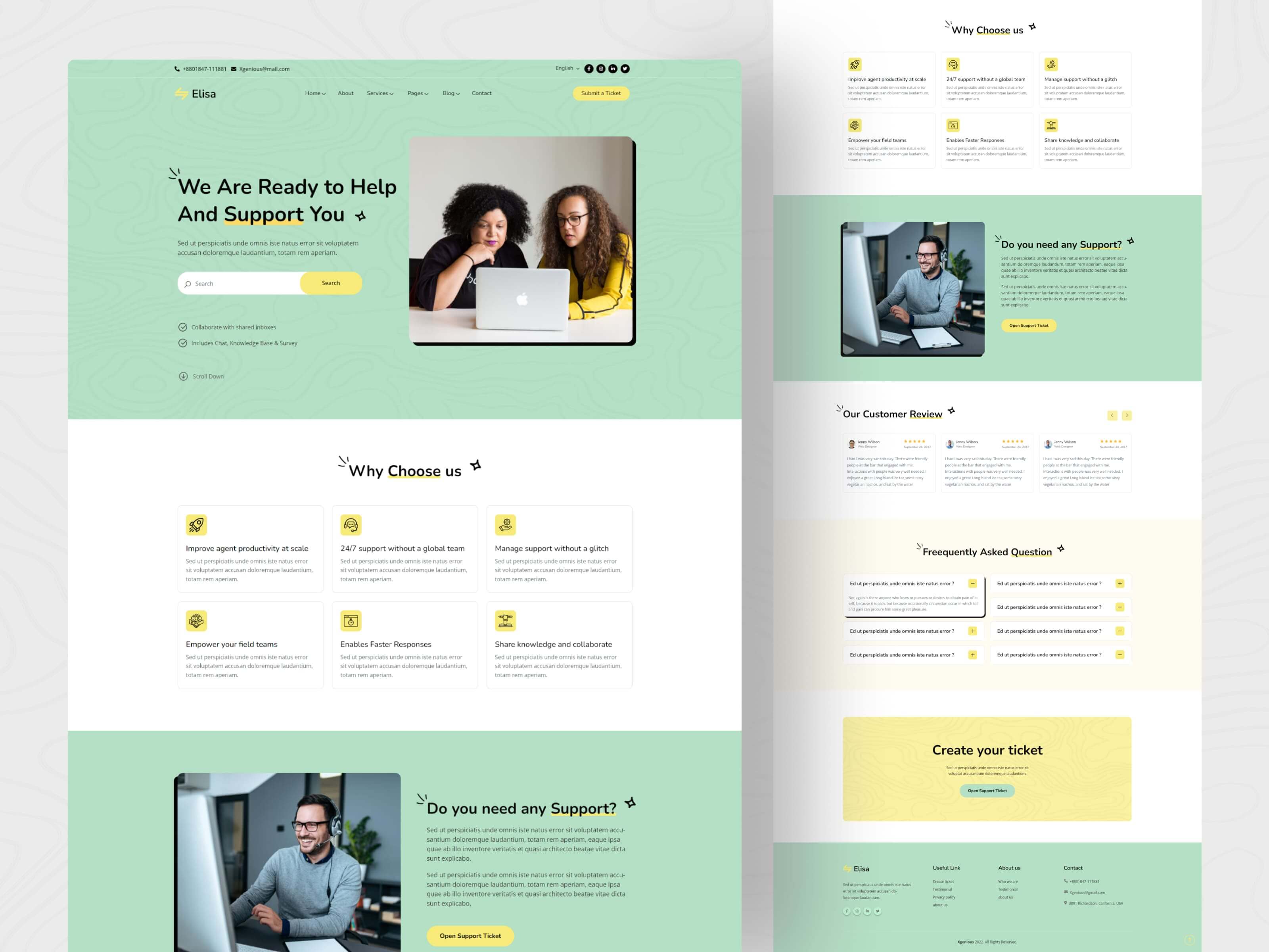
Support ticket description
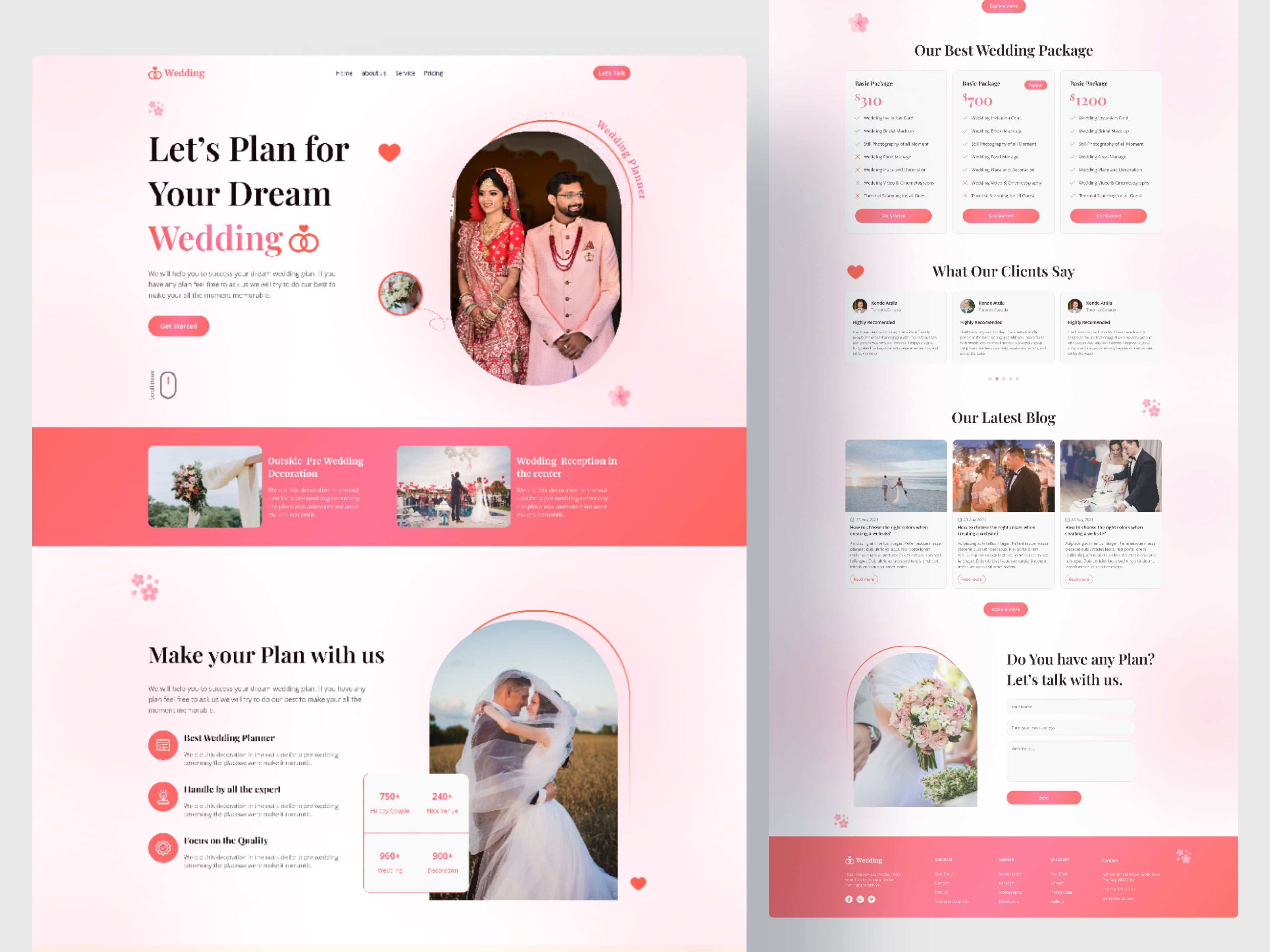
Wedding description
You can easily create your website by Build Site Now. We will provide all type of digital service for you.
Dashboard
Admin
User
Brand
Newsletter
Custom domain
Testimonial
Form builder
Own order manage
Page
Blog
Service
Donation
Job
Appointment
Event
Support ticket
Knowledgebase
Faq
Gallery
Video
Portfolio
ECommerce
Storage
Advertisement
Wedding price plan
Appearance settings
General settings
Language
Payment gateways
Themes
Hotelbooking
Restaurant
Domainreseller
Product
Stripe
Bank transfer
Bank transfer
Bank transfer
Bank transfer
Bank transfer
Bank transfer
Bank transfer
Bank transfer
Bank transfer
Bank transfer
Bank transfer
Theme-agency
Theme-article-listing
Theme-barber-shop
Theme-construction
Theme-consultancy
Theme-donation
Theme-eCommerce
Theme-event
Theme-job-find
Theme-newspaper
Theme-photography
Theme-portfolio
Theme-software-business
Theme-support-ticketing
Theme-wedding
You can easily create your website by Build Site Now. We will provide all type of digital service for you.
Blog 1
Dashboard
Admin
User
Brand
Newsletter
Custom domain
Testimonial
Form builder
Own order manage
Page
Blog
Service
Donation
Job
Appointment
Event
Support ticket
Knowledgebase
Faq
Gallery
Video
Portfolio
ECommerce
Storage
Advertisement
Wedding price plan
Appearance settings
General settings
Language
Payment gateways
Themes
Hotelbooking
Restaurant
Domainreseller
Product
Stripe
Bank transfer
Bank transfer
Bank transfer
Bank transfer
Bank transfer
Bank transfer
Bank transfer
Bank transfer
Theme-agency
Theme-article-listing
Theme-barber-shop
Theme-construction
Theme-consultancy
Theme-donation
Theme-eCommerce
Theme-event
Theme-job-find
Theme-newspaper
Theme-photography
Theme-portfolio
Theme-software-business
Theme-support-ticketing
Theme-wedding
You can easily create your website by Build Site Now. We will provide all type of digital service for you.
Dashboard
Admin
User
Brand
Newsletter
Custom domain
Testimonial
Form builder
Own order manage
Page
Blog
Service
Donation
Job
Appointment
Event
Support ticket
Knowledgebase
Faq
Gallery
Video
Portfolio
ECommerce
Storage
Advertisement
Wedding price plan
Appearance settings
General settings
Language
Payment gateways
Themes
Hotelbooking
Restaurant
Domainreseller
Product
Product simple search permission
Product advance search permission
Product duplication permission
Product bulk delete permission
Inventory
Inventory update product permission
Inventory simple search permission
Inventory advance search permission
Campaign
Stripe
Bank transfer
Bank transfer
Bank transfer
Bank transfer
Bank transfer
Bank transfer
Bank transfer
Bank transfer
Manual payment
Theme-agency
Theme-article-listing
Theme-barber-shop
Theme-construction
Theme-consultancy
Theme-donation
Theme-eCommerce
Theme-event
Theme-job-find
Theme-newspaper
Theme-photography
Theme-portfolio
Theme-software-business
Theme-support-ticketing
Theme-wedding
You can easily create your website by Build Site Now. We will provide all type of digital service for you.
Dashboard
Admin
User
Brand
Newsletter
Custom domain
Testimonial
Form builder
Own order manage
Page
Blog
Service
Donation
Job
Appointment
Event
Support ticket
Knowledgebase
Faq
Gallery
Video
Portfolio
ECommerce
Storage
Advertisement
Wedding price plan
Appearance settings
General settings
Language
Payment gateways
Themes
Hotelbooking
Restaurant
Domainreseller
Stripe
Bank transfer
Bank transfer
Bank transfer
Bank transfer
Bank transfer
Bank transfer
Bank transfer
Bank transfer
Bank transfer
Bank transfer
Theme-agency
Theme-article-listing
Theme-barber-shop
Theme-construction
Theme-consultancy
Theme-donation
Theme-eCommerce
Theme-event
Theme-job-find
Theme-newspaper
Theme-photography
Theme-portfolio
Theme-software-business
Theme-support-ticketing
Theme-wedding

Build Site Now made creating my business website a breeze. The interface is user-friendly, and their support team is always ready to help. I had my site up and running in no time, and it looks fantastic!

I can't thank Build Site Now enough! Their templates are stunning, and the customization options are endless. I built a professional-looking website without any coding knowledge. Highly recommend!

As a small business owner, I needed an affordable yet effective way to get online. Build Site Now delivered on all fronts. The drag-and-drop editor is intuitive, and the results are impressive. My site looks just like I imagined.


Build Site Now is an easy-to-use website builder that allows you to create your website without any coding or design skills. Simply choose from our collection of customizable templates, use the intuitive drag-and-drop interface to add content and features, and customize your site to match your brand. It's that simple!
Yes, absolutely! Build Site Now allows you to connect your own custom domain to your website. Connect an existing domain you already own.
Yes, all websites created with Build Site Now are automatically optimized for mobile devices. Our templates and designs are responsive, ensuring that your site looks great and functions seamlessly on smartphones and tablets.
Yes, Build Site Now offers e-commerce capabilities, allowing you to easily set up an online store and sell products. You can manage inventory, track orders, and securely process payments through popular payment gateways. Our platform provides a seamless and user-friendly e-commerce experience.
Nor again is there anyone who loves or pursues or desires to obtain pain of itself, because it is pain, but because.
